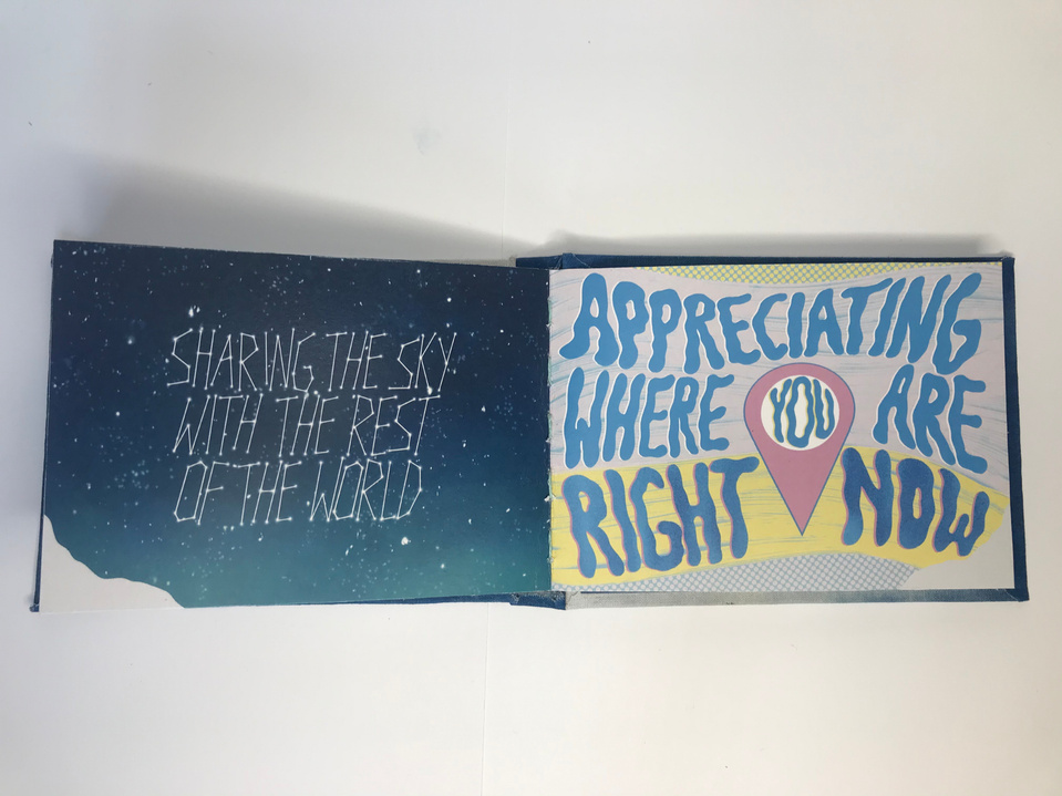
I have acted on some of the changes to the pages suggested by peers and my tutor to ensure the type is always complementing the image. I have also created an introductory page with hand lettering to introduce the ideas in the book, but going forward I will edit the type to flow more naturally with the wave design.
To help me decide which printers and paper to use for my book pages I ordered some samples from different printers. I have come to the conclusion that I will use the white 200gsm recycled paper from print.work. This is a place I know and trust to provide good quality prints as I use them for my art prints which I sell on my site. I also think the whitest option will show up the true colours of my designs and the thickness will help maintain the delicate structure of the book.
I have refined the pages and started to prepare them for print. In order to do so I have edited some designs and lettering to ensure nothing important is too close to the edges to allow some room for error when printing and trimming.
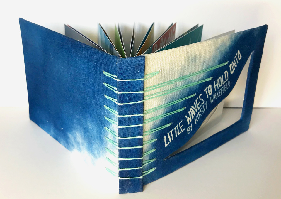
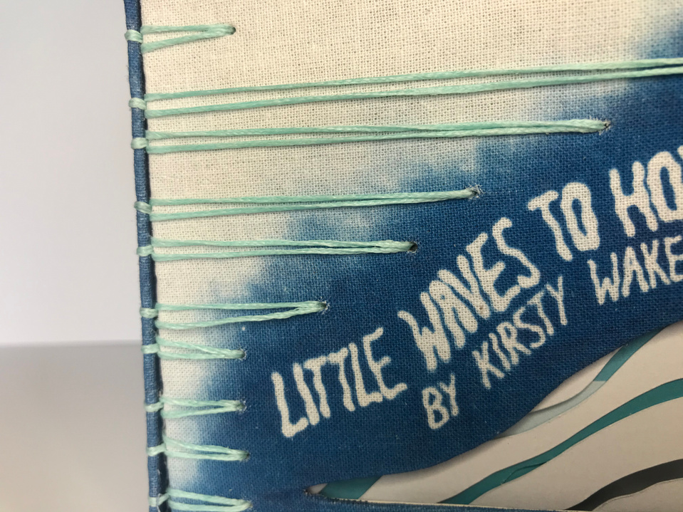
Having received the pages from the printers I have put the first book together with the finalised cyanotype covers. However, it has highlighted that I should change the inside of the covers for the rest of the copies as the white paper backing is too much of a contrast to the cyanotype borders, therefore going forward I will also colour the paper with the cyanotype process. I will also ensure on all future pieces that I allow for a slightly bigger border around the cut outs on the first page to ensure it is not too fragile.
Overall I am really pleased with the final outcome. It has a professional yet tactile and original quality to it and I feel it successfully conveys my concept and creates an interactive, sensory experience. I also feel this piece truly portrays who I have become as an Illustrator over the course of my degree. It combines the elements of both digital and traditional methods which I feel epitomise my style and allow me to fully explore how my artwork and developing skills in hand lettering can be elevated with the introduction of tactile mediums.
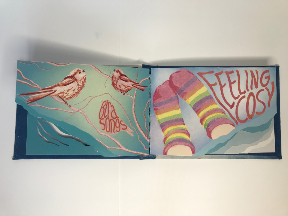
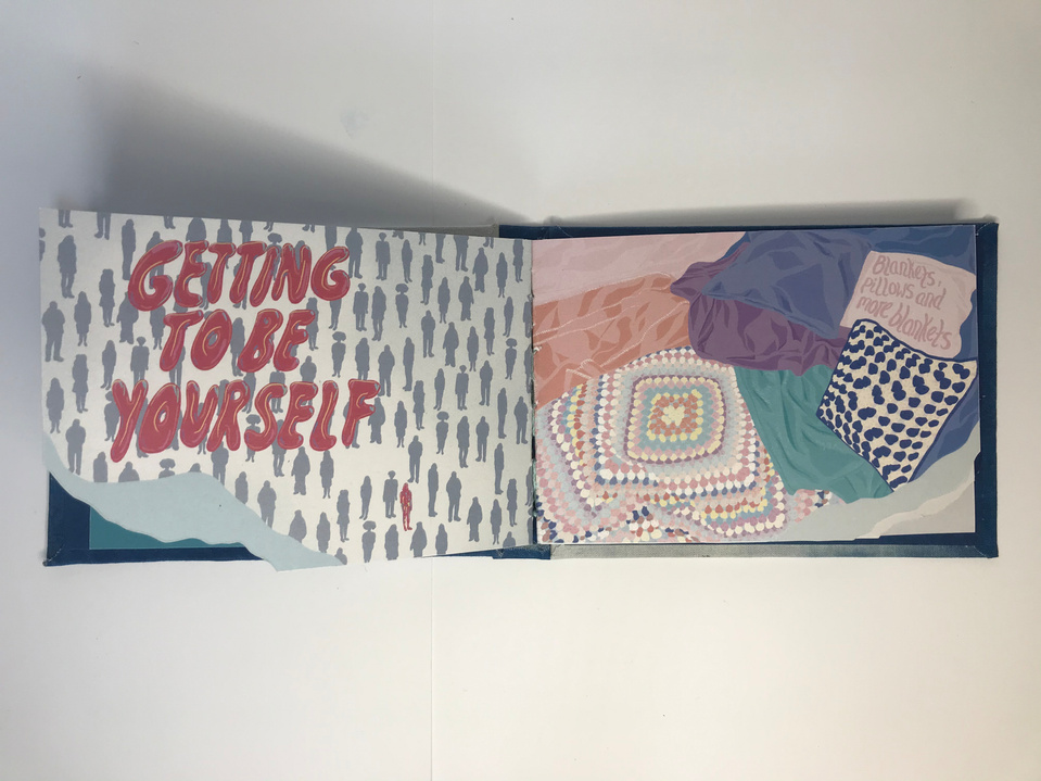
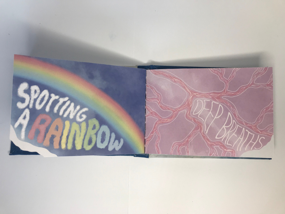
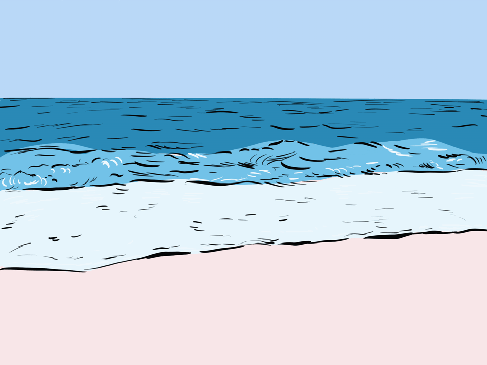
Furthermore, I feel the book will successfully appeal to a wide audience and going forward I will translate this into a digital form in order to reach more people. Little Waves to Hold Onto has encapsulated the metaphor of the sea as an unstoppable cycle of waves of positive emotion which will always be able to roll into our present. It is a physical experience which I feel myself and those I share this with, will be able to revisit and take comfort in from here on.
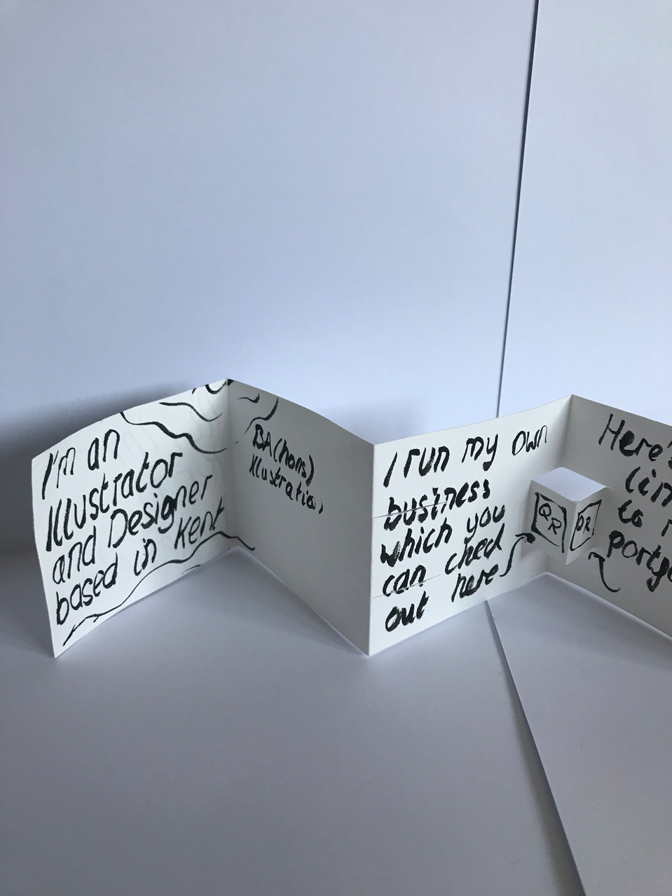
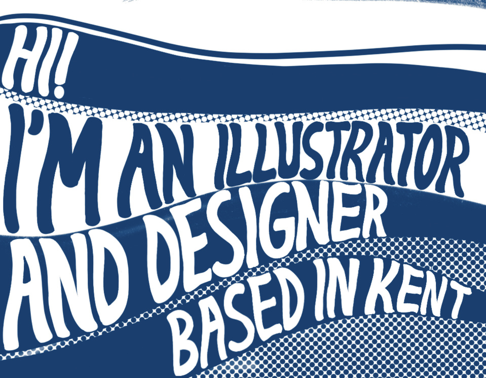
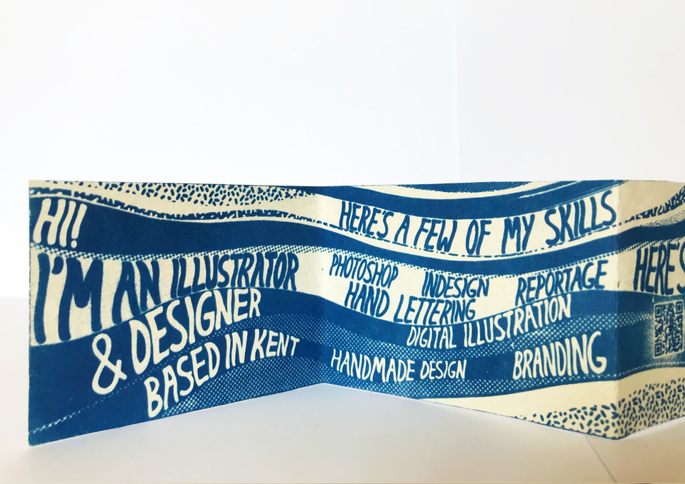
Having researched other successful examples of batch produced self promotion I experimented with the form my own could take and considered interactive pop up elements. However, as I began to design a concertina with a flowing design I decided cut out/pop up elements would disrupt its flow. Instead I chose to use a lighthearted, chatty tone while displaying my skills in hand lettering to create an interactive experience and a sense of personality which I found to be a successful element of other examples I had researched.
I chose to incorporate my logo as well as QR codes to act as quick interactive links to my portfolio and website which would display my work. However I had to make adaptions to the design to ensure these were clear enough to be scanned through the cyanotype outcome.
I also designed a small envelope which could hold the concertina together and mean it could be easily given out as well as posted. The final concertinas were created using the cyanotype process on 50x6cm pieces of 50% cotton, 250gsm cream paper in order to take the size of a typical business card but allow it to expand to display more about my work. I find this paper works well for the process and is able to hold its shape and structure.
I chose to use the cyanotype process as I feel it suits the nature of my work and is easily reproducable in a cost-effective manner. I like to combine digital and traditional methods to allow accuracy in my hand lettering and design but still create a hand made tactile feel. Therefore, I feel this piece successfully portrays who I am as an Illustrator and Designer and is a successful form of promotion which I can send out to potential clients and agencies.